When you think about skincare, most people focus on ingredients, textures, and results. But there’s a hidden influence shaping your choices every single day: color harmony in skincare packaging. The colors on bottles, jars, and labels don’t just look appealing; they impact how you feel about your products, whether you trust them, and even how often you use them. In today’s beauty industry, packaging is no longer just about containment—it’s about connection.
Designers and brands have realized that color harmony in skincare packaging can subtly guide emotions, build loyalty, and create consistency in daily routines. This isn’t just marketing fluff; it’s rooted in psychology and neuroscience. The shades you see every morning while reaching for your cleanser or moisturizer can either inspire calmness, energy, or even reluctance.
So why does color harmony matter so much, and how exactly does it influence the way you interact with your beauty routine? Let’s explore the powerful reasons behind this hidden design strategy.

1. Color Harmony in Skincare Packaging Creates Instant Emotional Connection
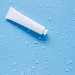
The first moment you see a skincare product, you don’t read the ingredient list—you feel the color. Cool tones like soft blues and greens signal freshness, purity, and calm, making you more likely to trust that a product is gentle. Warmer hues like peach, coral, or rose gold feel nurturing and energizing, creating an emotional connection before you even open the cap.
When brands use color harmony in skincare packaging, they carefully blend hues that balance these feelings. A pastel pink box with subtle gold detailing feels elegant yet soothing, which helps customers form an emotional bond with the brand and integrate it more easily into their routine.
2. Harmonious Colors Reinforce Brand Identity
Consistency builds trust, and that extends to packaging. If every product from a skincare line looks visually aligned through color harmony, users feel more assured of the brand’s professionalism and credibility. This consistency encourages people to purchase not just one product but a whole set, believing they work better together.
Think of luxury skincare brands that often use soft ivory paired with metallics—instantly recognizable and trustworthy. That’s the effect of color harmony in skincare packaging reinforcing brand identity in your daily choices.
3. Color Harmony Shapes Daily Rituals
Your skincare routine isn’t just a necessity—it’s a ritual. The way products look impacts how enjoyable or calming that ritual becomes. Harmonious packaging colors can reduce visual clutter in your bathroom or vanity, creating a sense of order and peace.
Imagine two scenarios: one where your shelf is filled with mismatched jars of every color, and another where tones of soft beige, sage green, and pale lavender work together seamlessly. The second environment feels intentional and calming, making you more likely to look forward to your daily skincare. That’s how color harmony in skincare packaging can transform routine into ritual.

4. Colors Subconsciously Communicate Product Benefits
Color psychology plays a huge role in how we perceive skincare effectiveness. For example:
- White and silver often suggest purity and advanced science.
- Green suggests natural, botanical, or organic benefits.
- Blue signals hydration and freshness.
- Gold hints at luxury and anti-aging power.
When these shades are harmonized across packaging, your subconscious mind quickly connects the dots and believes in the benefits. This is why color harmony in skincare packaging is more than aesthetics—it’s a silent communication tool that shapes product expectations.
5. Harmonious Packaging Increases Shelf Appeal
Walk down any beauty aisle, and you’ll notice certain products simply stand out. They aren’t louder or brighter; instead, they use cohesive and balanced color harmony that feels pleasing to the eye. This is intentional. Humans are naturally drawn to balanced visuals, which explains why we gravitate toward shelves with harmonious tones rather than chaotic clashes.
By using color harmony in skincare packaging, brands ensure their products look not just beautiful but also approachable and trustworthy. This increases shelf appeal and, in turn, consumer confidence.
6. Consistent Colors Enhance Memory Recall
Another hidden effect of harmonious packaging colors is memory. If you use a product with consistent and calming color schemes, your brain associates those colors with the experience. The next time you see similar tones, you recall the product more easily.
This is why so many skincare lines stick to a particular palette. Color harmony in skincare packaging makes products memorable, helping brands stay top of mind and making it easier for you to stick with your routine.
7. Color Harmony Influences Long-Term Loyalty
Beauty routines are personal, and loyalty grows when people feel emotionally aligned with a brand. When a skincare line presents its products in harmonious, well-designed packaging, it creates not just visual satisfaction but also a sense of trust and reliability. Over time, this builds loyalty.
Many users admit they buy from brands whose packaging “just looks right” on their vanity. That’s the subtle but powerful role of color harmony in skincare packaging—it keeps people coming back not only for the product but also for the feeling it creates.

Frenquently Asked Questions (FAQS) About Color Harmony in Skincare Packaging
Q1. Why is color harmony in skincare packaging more effective than bold, clashing colors?
Balanced colors are easier for the brain to process and create a sense of calm and trust. Bold, mismatched shades may grab attention briefly but rarely encourage long-term connection or brand loyalty.
Q2. How does color harmony impact my personal beauty routine?
When your products visually harmonize, your routine feels more organized and soothing. This creates a positive ritual, making you more likely to stick with it consistently.
Q3. Do different age groups respond differently to color harmony in skincare packaging?
Yes. Younger audiences often appreciate brighter yet cohesive palettes, while older audiences tend to favor muted, luxurious tones. However, harmony remains universally effective across demographics.
Q4. Can color harmony in skincare packaging actually influence how effective I think a product is?
Absolutely. If a packaging color suggests hydration, purity, or natural ingredients, your brain is primed to believe in those benefits even before you test the product.
Q5. Why do some skincare brands rebrand with new color harmonies?
Brands update packaging to realign with consumer expectations, market trends, or evolving brand identity. Color harmony ensures the transition feels fresh but still trustworthy.
Want More Blogs Like These?
Check out more insights in Beauty Bliss on Designs24hr, where we explore how design psychology transforms your daily beauty routines.