Choosing the right color palettes for interior design is more than just picking pretty colors—it’s the foundation of a space’s mood, purpose, and personality. But with so many hues, tones, and combinations available, how do you select the right ones without second-guessing every wall or pillow?
In this guide, we’ll walk you through 10 powerful and timeless color palettes for interior design that are proven to work in real homes—no trendy regrets, no clashing chaos. Whether you’re designing a cozy living room, a modern kitchen, or a peaceful bedroom, these palettes offer something for every aesthetic.
Let’s dive into colors that don’t just decorate—they transform.

1. Warm Earth Tones for Natural Calm
There’s a reason earth-toned color palettes for interior design have remained popular—they ground your space. Think shades of terracotta, clay, sand, olive, and muted brown.
This palette creates warmth, comfort, and timeless elegance.
Use in: Living rooms, entryways, and dining spaces
Pairs well with: Natural wood, linen, woven baskets, and greenery
2. Cream and White with Soft Neutrals
When in doubt, neutrals win. A clean and airy color palette with whites, creams, soft grays, and pale taupe offers endless versatility.
This is one of the most adaptable color palettes for interior design, perfect for minimalist, Scandinavian, or Japandi styles.
Use in: Bedrooms, open-plan homes, bathrooms
Pairs well with: Black accents, chrome fixtures, and soft textures
3. Coastal Blues and Sandy Beige
Inspired by the sea and shore, this palette includes soft sky blues, navy, crisp whites, and sandy beige. It’s fresh, calming, and ideal for light-filled interiors.
These coastal-inspired color palettes for interior design evoke relaxation and a sense of openness.
Use in: Living rooms, beach houses, sunrooms
Pairs well with: Rattan furniture, driftwood, whitewashed floors
4. Monochrome Black and White
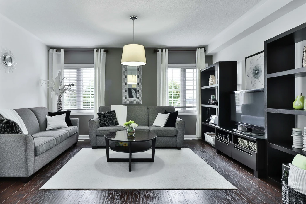
Nothing says bold and timeless like a high-contrast black and white color palette. It adds structure, drama, and modern elegance.
A clean blog-worthy look and one of the easiest color palettes for interior design to modernize.
Use in: Kitchens, bathrooms, offices
Pairs well with: Gold hardware, marble, and glass elements
5. Soft Pastel Layers
Layering muted shades of blush pink, mint green, pale lavender, and soft peach creates a fresh, calming space with a touch of whimsy.
These subtle color palettes for interior design add a gentle personality to a room without overpowering it.
Use in: Nurseries, bedrooms, creative studios
Pairs well with: Matte white, natural textiles, soft lighting
6. Moody Jewel Tones
Deep, luxurious shades like emerald green, sapphire blue, amethyst purple, and ruby red bring richness and depth to any space.
Perfect for those who want their color palettes for interior design to be bold but sophisticated.
Use in: Dining rooms, home libraries, accent walls
Pairs well with: Velvet textures, brass accents, dark wood
7. Industrial Grays and Charcoal
Modern, sleek, and slightly edgy, this palette leans on cool grays, charcoal, and slate tones. It’s great for creating a refined, masculine feel.
One of the most modern color palettes for interior design, especially in urban or loft spaces.
Use in: Home offices, kitchens, loft-style living areas
Pairs well with: Concrete finishes, steel, matte black
8. Desert Sunset Palette
Inspired by desert landscapes, this palette combines burnt orange, soft coral, dusty rose, and warm sand.
This trend-forward color palette for interior design is warm and inviting without being overpowering.
Use in: Living rooms, entryways, outdoor-inspired interiors
Pairs well with: Terra cotta pots, light wood, raw textiles
9. Forest Greens and Earthy Browns
Perfect for biophilic and nature-inspired homes, this combo includes sage, moss green, walnut brown, and bark-inspired hues.
Great for grounding interiors and connecting with nature, this color palette for interior design promotes a sense of calm and harmony.
Use in: Bedrooms, studies, wellness spaces
Pairs well with: Plants, stone textures, organic shapes
10. High-Energy Color Pops
For bold creatives, a neutral base paired with high-contrast pops of color (mustard yellow, cobalt blue, hot pink) adds personality without clutter.
This is a dynamic, modern color palette for interior design that works best when the bold tones are used sparingly.
Use in: Creative studios, modern apartments, kids’ playrooms
Pairs well with: Clean lines, monochrome furniture, statement art
How to Choose the Right Color Palette for Your Space
With so many color palettes for interior design, it can feel overwhelming to pick just one. Here’s a quick framework:
- Start with your mood: Calm, cozy, bold, or energizing?
- Consider light: Natural lighting changes how colors appear.
- Match your function: Colors should suit how the room is used.
- Stick to a 60/30/10 rule: 60% base, 30% secondary, 10% accent.
Remember, a well-chosen color palette for interior design doesn’t just look good—it feels right.
Final Thoughts
Color is more than decoration—it’s design psychology. Whether you prefer a muted neutral palette or dramatic jewel tones, the right color palettes for interior design help you express your personality and create a mood that supports your lifestyle.
Don’t follow fleeting color trends. Stick to what resonates with your space, your light, and your energy. Use these tried-and-true combinations to guide your next interior project.
Looking for more home design tips, style breakdowns, or space-transforming ideas? Check out more in our Living Spaces category and bring your interiors to life with purpose and palette.


