Choosing the right typography for skincare brands is more than a design decision—it’s a visual expression of your brand’s identity. In a saturated beauty market, typography can either elevate your skincare brand or make it fade into the background. Whether your line is science-driven, plant-based, luxurious, or youthful, your font choices tell a silent but powerful story.
In this guide, we’ll explore how typography for skincare brands can create emotional resonance, influence user trust, and shape the perception of your products. We’ll walk through seven effective strategies to help you match the typography to your skincare brand’s vibe—from clean and minimal to bold and editorial.

1. Understand the Emotional Impact of Typeface
Every font has a mood. Serif fonts often signal tradition and trust, while sans-serif fonts feel clean and modern. If your skincare line emphasizes clinical precision (e.g., anti-aging serums or dermatologist-tested products), typography for skincare brands in sharp, minimal sans-serif fonts like Helvetica Neue or Lato is a smart match. On the other hand, artisanal or organic brands might opt for softer, rounder fonts like Quicksand or Playfair Display, which evoke calm and nature.
By selecting a typeface that reflects the core personality of your skincare line, you’re sending subconscious cues to your target audience.
2. Match Typography to Product Packaging Aesthetic
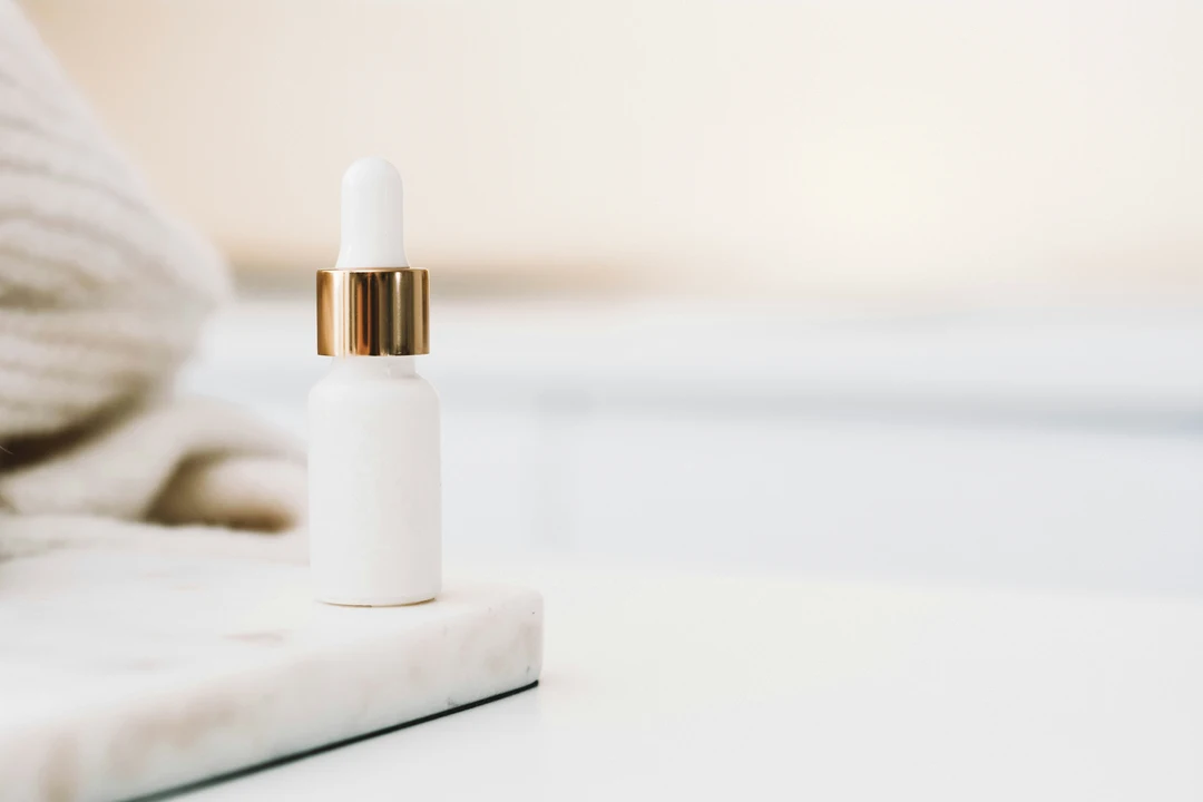
Your digital and print typography should feel connected to your physical packaging. If you use matte, minimalist packaging with lots of whitespace, your web typography for skincare brands should follow suit with airy line spacing and modern sans-serifs.
In contrast, luxury skincare products often incorporate elegant serif or script fonts to match their gold accents, embossed bottles, or glass containers. Consistency in typography across web, print, and packaging builds visual harmony and brand recognition.
3. Typography Hierarchy: Build Trust Through Clarity
Customers browsing skincare websites often scan for ingredients, claims, or results. Your typography hierarchy—how you structure H1s, H2s, body text, and captions—must make the browsing experience intuitive.
Use clear H1s for product categories like “Anti-Aging,” “Hydration,” or “Sensitive Skin.” Subheadings in smaller but bolder fonts help highlight benefits or key ingredients. Easy-to-read body fonts build trust, especially for users researching skincare solutions.
An effective typography for skincare brands layout includes:
- A readable body font (14–16px)
- High-contrast text for accessibility
- Clear spacing and margins
- A consistent hierarchy from headline to CTA
4. Use Typography to Differentiate Product Lines
If your skincare brand has multiple product ranges—say, a hydrating line, a brightening line, and a sensitive skin line—you can use variations in typography to subtly separate them.
For instance, use a bold, modern sans-serif for your brightening line (which often attracts a younger, trendier audience), while a classic serif font might work better for anti-aging products aimed at older customers. These differences in typography for skincare brands help the user quickly understand the function and tone of each product line without needing to read the full description.
5. Consider Mobile Typography Early
Most skincare purchases begin on mobile. If your typography doesn’t render well on smaller screens, your conversion rate will suffer. When choosing typography for skincare brands, always test on mobile devices first.
Use these mobile-friendly typography practices:
- Avoid ultra-thin fonts that disappear on retina screens
- Use minimum 16px for body text
- Limit decorative fonts to headlines only
- Keep line length between 50–75 characters
A clean, legible mobile design can make the difference between a bounce and a purchase.
6. Align Typography with Target Demographic
Who is your skincare for? A Gen Z brand focused on acne solutions might use funky, rounded, or handwritten-style fonts. A luxury anti-aging serum for women over 40 might require an elegant serif with plenty of whitespace.
Typography for skincare brands must appeal visually to the demographic you’re serving. A font that looks trendy and casual to one audience may seem unprofessional to another. Test font styles with real users from your target market, and use A/B testing to fine-tune based on performance.
7. Use Typography as a Brand Signature
Think about Glossier’s iconic sans-serif typeface or The Ordinary’s clinical, no-nonsense look. Their typography is instantly recognizable. The goal for your skincare brand should be the same.
Developing signature typography for skincare brands can involve:
- Custom kerning or letter spacing
- Using a unique typeface across all platforms
- Designing your logo with a font that becomes your visual signature
Over time, typography can become synonymous with your brand identity, allowing you to stand out in product feeds, packaging, and promotions.
Final Thoughts
Typography isn’t just about picking pretty fonts. It’s about aligning your visuals with your brand’s voice, values, and audience. With the right typography for skincare brands, you can strengthen your product appeal, clarify your messaging, and inspire confidence in your customers.
Whether you’re creating a minimalist clean beauty brand or a glamorous high-end line, using typography intentionally will elevate every element of your presence—from packaging to promotions.
Explore More in Beauty Bliss
Ready to take your skincare brand design to the next level?
Explore more powerful insights and visual storytelling tips in Beauty Bliss on Designs24hr.
