Before You Use Figma’s New AI Design Tools, Check These 8 Things First
Figma AI can help you move faster with Motion, Code Layers, Shader Effects, AI-generated plugins, prototypes, and design ideas. But faster design is not automatically better design. Use this checklist to avoid generic AI output, protect your brand style, and keep human taste in charge.
Use Figma AI for speed, exploration, and creative momentum, but do not let it make the final design decisions for you. Before you share, ship, or hand off a design, check the goal, brand style, layout, spacing, motion, shader effects, code layers, accessibility, and final polish.
Figma AI is best used as a creative assistant. It can help you explore faster, but the final design still needs your judgment, taste, user understanding, and quality control.
Figma’s newer AI design features are exciting because they bring more creation directly into the canvas. Instead of only arranging static frames, designers can now think about motion, code-backed layers, shader-style effects, generative workflows, and AI-assisted iteration in one place.
That can save time. It can also create a new problem: designs that look polished at first glance but feel generic, overdecorated, off-brand, hard to use, or difficult for developers to trust.
This Figma AI design checklist is for designers, creators, marketers, small business owners, and product teams who want to use AI design tools without letting the work turn into forgettable AI slop.
What Changed With Figma AI and Config 2026?
Figma’s Config 2026 updates expanded what can happen inside the design canvas. Figma highlighted new materials and tools such as Code Layers, Figma Motion, shaders, generative plugins, Weave tools, and stronger AI-assisted workflows. Figma’s release notes also mention Motion, 3D transforms, and shaders as part of the newer creative workflow.
That matters because Figma is no longer only a place to design screens. It is becoming a place where ideas, interactions, code-backed prototypes, visual effects, and AI assistance can live closer together.
Simple takeaway: Figma AI can help you create faster, but the more powerful the tool becomes, the more important your final quality check becomes.
What Does “AI Slop” Mean in Design?
In design, “AI slop” usually means output that looks finished but feels average, generic, overproduced, or disconnected from the real project. It may use trendy gradients, glass effects, floating cards, animated elements, or fancy textures without solving the actual design problem.
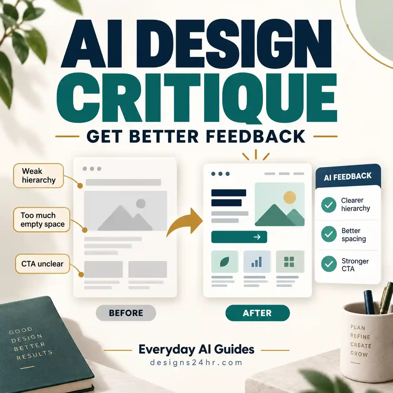
A design can look impressive in a quick screenshot and still fail because it has weak hierarchy, unclear actions, poor accessibility, confusing motion, inconsistent brand style, or messy handoff details.
The goal is not to avoid AI. The goal is to avoid careless AI use.
Figma AI Design Checklist: 8 Things to Check Before You Ship
Before you publish, present, or hand off a Figma AI-assisted design, run through these eight checks.
Clear Goal
Know what the design needs to do before you prompt AI. Are you trying to improve signups, explain a product, show pricing, onboard users, or make a prototype feel more real?
Brand Style
Check whether the colors, type, icons, spacing, imagery, voice, and visual mood still match the brand. AI often reaches for generic “modern app” styling unless you guide it.
Strong Layout
Review hierarchy, balance, alignment, rhythm, and reading order. A layout is not strong just because it has gradients, cards, and floating objects.
Spacing and Hierarchy
Check whether the most important message is obvious within seconds. Fix cramped sections, uneven padding, weak contrast, and buttons that do not feel important enough.
Motion Review
Use Figma Motion to support meaning, not to distract users. Motion should guide attention, explain change, or make interaction feel clearer.
Shader Restraint
Shader Effects can add depth, texture, and polish, but too many effects can make a design feel noisy. Use them only where they support the message or product mood.
Code Layer Testing
If you use Code Layers, test the interaction, responsiveness, states, labels, and handoff quality. Code-backed does not automatically mean production-ready.
Final Human Quality Check
Before you call the design done, review it like a senior designer. Check taste, clarity, accessibility, brand fit, edge cases, and whether the design actually solves the user’s problem.
Start With a Better Figma AI Prompt
The quality of your Figma AI output depends heavily on the quality of your instruction. A weak prompt usually creates a weak design direction. Instead of saying “make this better,” give Figma AI the goal, audience, brand style, layout constraints, interaction needs, and what you want to avoid.
| Weak prompt | Better prompt direction |
|---|---|
| Make this screen look modern. | Improve this SaaS dashboard hero for a time-strapped founder. Keep the layout clean, high-contrast, trustworthy, and conversion-focused. Avoid generic glassmorphism and unnecessary decoration. |
| Add animation. | Add subtle motion that guides the user from headline to primary CTA. Keep it calm, accessible, and easy to understand. |
| Make it more premium. | Refine the spacing, typography scale, color contrast, and card hierarchy so the page feels premium without adding clutter. |
| Add effects. | Use one restrained shader or depth effect only where it supports the product story. Do not make the interface feel noisy or decorative. |
How to Use Figma Motion Without Distracting Users
Figma Motion can make prototypes and product ideas feel more alive, but motion should never be added just because the tool makes it easy. Good motion explains what changed, helps users follow the interface, and supports the flow of attention.
Use motion for:
- Showing how a menu opens or closes
- Guiding attention to the next step
- Explaining state changes, loading, or progress
- Making a prototype feel closer to the final product
- Testing interaction ideas before development
Motion rule: If the animation does not make the experience clearer, calmer, or easier to understand, remove it or simplify it.
How to Use Shader Effects Without Overdesigning
Shader Effects can help create depth, texture, light, glow, glass, or material-like visuals. That can be useful for landing pages, product visuals, creative portfolios, hero sections, and concept work.
The risk is that shaders can quickly overpower the design. A page can start to look like a tool demo instead of a useful product experience.
- Use one main effect direction instead of many competing effects.
- Keep text readability stronger than visual texture.
- Do not place busy shaders behind important copy.
- Check mobile views before approving visual effects.
- Make sure effects match the brand, not just the trend.
How to Review Code Layers Before Handoff
Code Layers can make Figma feel closer to real product building, but designers should still review them carefully. A code-backed idea can still have usability problems, accessibility issues, unclear states, or development assumptions that need review.
| Check | What to review |
|---|---|
| Responsiveness | Does the component still work on smaller screens, wider screens, and different content lengths? |
| States | Are hover, focus, active, loading, empty, success, and error states clear? |
| Accessibility | Are labels, contrast, keyboard behavior, and readable text handled properly? |
| Handoff | Can developers understand what is final, what is experimental, and what still needs engineering review? |
Red Flags Your Figma Design Looks Like AI Slop
If your design has several of these problems, it may need a stronger human review before you share it.
- Everything looks like a template: The page could belong to any startup, any app, or any product.
- The effects are louder than the message: Gradients, shaders, cards, and animations distract from the actual content.
- The hierarchy is unclear: Users cannot quickly tell what to read first or what action to take.
- The design ignores the brand: Colors, typography, and tone feel disconnected from the business or audience.
- Motion feels decorative: Animation exists, but it does not help the user understand the interface.
- The handoff is messy: Developers cannot tell what is real, what is experimental, and what needs to be rebuilt.
- Accessibility was skipped: Contrast, focus states, readable type, and responsive behavior were not reviewed.
Best Uses for Figma AI
Figma AI can be extremely useful when you treat it as a fast collaborator instead of a final decision-maker.
Use Figma AI for
- Fast idea exploration
- UI layout variations
- Prototype concepts
- Motion tests
- Shader and visual effect experiments
- Code-backed interaction ideas
- Early creative direction
- Workflow acceleration
Do manually before shipping
- Final taste review
- Brand consistency check
- Accessibility review
- Responsive layout testing
- Content clarity review
- Interaction logic review
- Developer handoff cleanup
- User goal validation
AI Should Speed Up Design, Not Replace Design Judgment
The strongest designers will not be the people who avoid AI completely. They will be the people who know how to use AI quickly, then review the result with taste, restraint, usability knowledge, and brand judgment.
That is especially important because design is not only a technical output. Good design depends on context, emotion, clarity, audience, timing, brand fit, and tradeoffs. AI can suggest options, but you still need to decide what belongs.
Simple Scorecard Before You Share a Figma AI Design
Before you send the file to a client, developer, stakeholder, or team, rate the design from 1 to 5 in each area.
| Category | Question to ask |
|---|---|
| Goal clarity | Does the design clearly support one main goal? |
| Brand fit | Does it feel like this brand, or could it belong to anyone? |
| Hierarchy | Can someone understand the message and next step quickly? |
| Visual restraint | Are motion, shaders, and effects helping instead of distracting? |
| Accessibility | Are contrast, text size, labels, and focus states usable? |
| Handoff quality | Can developers or teammates understand what is final and what needs review? |
Scorecard rule: If any category scores 1 or 2, do another design pass before presenting the work.
Useful prompt to copy:
Act as a senior UI/UX design reviewer. I am using Figma AI, Motion, Code Layers, and Shader Effects for a design project. Review my design direction for generic AI output, weak hierarchy, off-brand styling, poor spacing, unnecessary effects, confusing motion, accessibility issues, responsive layout problems, and handoff risks. Give me a clear checklist of what to improve before I publish, present, or share the design. Tip: For a stronger review, add your audience, product type, brand style, screen goal, and where the design will be used.
Use Designs24hr Tools to Improve Your AI Design Workflow
If you are using Figma AI for a landing page, app screen, prototype, or content design, the free tools on Designs24hr can help you check the details before publishing.
For visual polish
- Color Palette Generator: Use it to create brand-safe color directions before prompting AI.
- CSS Gradient Generator: Use it to build cleaner background gradients and UI accents.
- Aspect Ratio Calculator: Use it for responsive layouts, thumbnails, exports, and social visuals.
For content and SEO checks
- Title Meta Previewer: Use it to preview landing page titles and search snippets.
- AI Prompt Generator: Use it to create better instructions for Figma AI and design review prompts.
- How It Works? Use it to simplify new Figma features before explaining them to clients or teammates.
You can find these tools on the Designs24hr homepage.
Sources and Further Reading
This article references official Figma pages and recent coverage to keep the guide current. Always check Figma’s own pages for the latest availability, beta status, and feature changes before planning a production workflow.
Figma AI Design Checklist FAQ
What is the Figma AI Design Checklist?
The Figma AI Design Checklist is a simple review system for using Figma AI, Figma Motion, Code Layers, and Shader Effects without creating generic, messy, or off-brand design work.
What are Figma Code Layers?
Figma Code Layers are part of Figma’s newer design-to-code direction. They help bring code-backed ideas closer to the design canvas, but designers should still test responsiveness, states, accessibility, and handoff quality before treating a code-backed idea as final.
What is Figma Motion?
Figma Motion brings timeline-based motion and animation workflows into Figma. It can help designers test interaction ideas, create more expressive prototypes, and communicate motion behavior more clearly.
What are Figma Shader Effects?
Figma Shader Effects help designers add visual effects such as depth, texture, light, and material-style treatments. They can make designs feel richer, but they should be used carefully so the interface stays readable and useful.
How do I avoid AI slop in Figma?
Start with a clear goal, protect your brand style, check hierarchy and spacing, use motion and shaders with restraint, test code layers, review accessibility, and keep a human designer in charge of the final quality decision.
Should designers use Figma AI?
Yes, designers can use Figma AI for faster exploration, prototyping, motion ideas, and creative iteration. But AI should support the design process, not replace final judgment, user understanding, brand direction, or accessibility review.
Is Figma AI good for beginners?
Figma AI can help beginners explore design ideas faster, but beginners should be careful not to accept every AI result as good design. A checklist helps you review spacing, hierarchy, brand fit, readability, and usability before sharing your work.
What is the biggest mistake when using AI design tools?
The biggest mistake is treating AI output as finished work. AI can create a strong starting point, but the final design still needs human review for clarity, taste, accessibility, brand fit, and real user needs.
Bottom Line
Figma AI, Motion, Code Layers, and Shader Effects can help you create faster and explore more ideas. But the best design still needs human taste, restraint, structure, and judgment.
Best workflow: use AI to speed up exploration, then use this checklist to protect the final quality.
Designs24hr helps everyday creators, designers, students, and business owners understand AI tools and use them in practical, trustworthy ways.