An AI image aspect ratio guide is useful before you generate—not only after an image looks wrong. First choose where the visual will appear, then select a matching canvas shape, plan the composition for that shape, and calculate the final pixel dimensions.
A square image, a tall Pinterest graphic, and a wide blog hero may show the same idea, but they need different focal-point placement and margins. After choosing the best shape, calculate the matching width or height before generating or resizing the finished image.
Quick answer: Start with 1:1 for flexible square graphics, 4:5 for tall feed images, 2:3 for Pinterest-style vertical graphics, 9:16 for full-screen vertical content, 16:9 for blog heroes and presentations, and 3:2 for natural landscape compositions. These are practical starting points—not universal requirements.
Quick AI Image Aspect Ratio Guide
Choose the final use before choosing the ratio. A ratio describes the shape of the canvas, while the example pixel dimensions provide one practical export size for that shape.
| Ratio | Practical starting size | Common use | Composition guidance |
|---|---|---|---|
| 1:1 | 1200 × 1200 | Square graphics, product-style layouts and flexible social assets | Keep the focal object near the center with balanced space on all sides. |
| 4:5 | 1080 × 1350 | Tall feed graphics, promotional cards and portrait compositions | Use the extra height intentionally and avoid placing details against the top or bottom edge. |
| 2:3 | 1000 × 1500 | Pinterest Pins, vertical guides and poster-style graphics | Build a strong top-to-bottom hierarchy with mobile-readable text space. |
| 9:16 | 1080 × 1920 | Full-screen vertical content, story layouts and vertical covers | Use a clear vertical path and reserve generous interface-safe margins. |
| 16:9 | 1600 × 900 | Blog heroes, presentation slides, videos and wide web sections | Leave side space for responsive cropping and avoid a tiny central subject. |
| 3:2 | 1500 × 1000 | Natural landscape images, editorial visuals and photography-style layouts | Use thirds, foreground depth and a balanced horizon or architectural line. |
Pinterest note: Pinterest currently recommends a 2:3 aspect ratio or 1000 × 1500 pixels for standard image Pins and says taller formats may be cut off in feeds. Always recheck official specifications before an important campaign because platform requirements can change.
Calculate Your Exact Image Dimensions
Know the ratio but not the final size? Use the Designs24hr calculator to find a ratio, calculate a missing width or height, or start with a common preset without doing the math manually.
Find the ratio of an existing width and height, or calculate dimensions for a ratio you already know.
Start with formats such as 1:1, 2:3, 9:16 or 16:9, or enter your own proportional width and height.
Add the target width or height and the calculator fills in the matching side while preserving the selected ratio.
Choose 16:9 and enter a width of 1600 pixels. The matching height is 900 pixels.
The calculator provides the correct ratio and matching dimensions. It does not crop or resize the actual image file.
Aspect Ratio vs. Image Size and Resolution
Aspect ratio describes shape. It compares width with height, such as 16:9 or 2:3. It does not tell you how many pixels an image contains.
Image dimensions describe the actual pixel width and height. A 16:9 image could be 1280 × 720, 1600 × 900, 1920 × 1080 or another proportional size. Every example has the same shape but a different pixel count.
Resolution affects how much visual information the file contains. An image can have the correct ratio and still look blurry because its pixel dimensions are too small. It can also be large and sharp but composed poorly for the intended crop.
Ratio Answers
What shape should the canvas have?
- Square
- Portrait
- Vertical
- Landscape
- Widescreen
Dimensions Answer
How many pixels should the exported file contain?
- 1200 × 1200
- 1000 × 1500
- 1080 × 1920
- 1600 × 900
- 1500 × 1000
Do not stretch an image to force a new ratio. Stretching changes the proportions of every object. Crop, expand, regenerate or rebuild the composition instead.
Correct shape but insufficient pixels? Enlargement is a separate decision. Review the AI Image Upscaler Checklist before publishing an enlarged file, because AI upscaling can reconstruct details rather than merely making existing pixels larger.
Use the FRAME Method Before You Generate
The FRAME method turns aspect-ratio selection into a repeatable design decision. It helps prevent the common mistake of generating an attractive image first and trying to force it into several incompatible layouts later.
F — Final Destination
Name the exact placement: blog featured image, Pinterest Pin, presentation cover, social graphic, advertisement, email banner or website header. “A marketing image” is too broad because each placement can require a different shape.
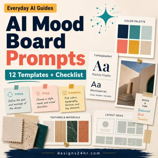
For a larger campaign, plan the visual direction with AI mood board prompts before producing separate assets. This helps establish the palette, materials, lighting, layout and exclusions before ratio-specific generation begins.
R — Ratio
Select the canvas shape that matches the destination. Use the ratio chart as a starting point, then verify any platform-specific requirement before publishing.
A — Anchor
Choose where the main non-living focal object should sit. Center placement works well for balanced square graphics. A left-third or right-third anchor can leave useful headline space in wide hero images. A lower-third anchor can create room for a title near the top of a vertical graphic.
M — Margins
Protect important details from cropping. Reserve extra space around headlines, buttons, product edges, diagrams and other critical elements. Do not place important information directly against the canvas boundary.
E — Export
Confirm the final dimensions, file format, compression, crop and mobile readability. The generation output is not automatically the finished publishing asset.
Worked example: A Pinterest article graphic could begin at 2:3 and 1000 × 1500 pixels, use a strong top-to-bottom hierarchy, place the main non-living objects in the lower two-thirds, and reserve clean headline space near the top. Check the exported result at actual phone size before publishing.
Best Aspect Ratios for AI Images by Use
1:1 for Flexible Square Graphics
A 1:1 canvas is useful when you need a balanced composition that can work in grids, cards and square previews. It suits centered product-style arrangements, simple diagrams, quote-free promotional graphics and icon-led layouts.
Square images have less horizontal storytelling space than landscape formats and less vertical hierarchy than tall formats. Keep the idea focused. One clear object group usually works better than several small competing scenes.
4:5 for Tall Feed Images
A 4:5 ratio provides more vertical space than a square without becoming a full-screen story format. It works well for stacked cards, tall product arrangements, step-based graphics and portrait compositions.
Use the height to create hierarchy rather than filling every area. Keep important information away from the extreme top and bottom, where previews or interface elements may compete with it.
2:3 for Pinterest Pins and Vertical Guides
A 2:3 format is a strong starting choice for Pinterest Pins, visual guides and poster-style content. It supports a clear sequence: promise near the top, supporting visual in the middle and branding or action near the bottom.
Do not treat the extra height as permission to add excessive text. A Pin still needs to communicate its promise quickly on a phone screen.
9:16 for Full-Screen Vertical Content
A 9:16 image fills a vertical phone screen and can support story-style sequences, video covers and full-height mobile visuals. The composition should guide the eye from top to bottom.
Reserve larger safe areas than you would for a static poster. Interface controls, captions and device differences can cover or crop important elements.
16:9 for Blog Heroes and Presentations
A 16:9 ratio works well for wide blog visuals, presentation slides and video-related assets. It provides room for a focal object on one side and intentional negative space on the other.
Responsive websites may crop wide featured images differently across archive cards, desktop layouts and mobile screens. Keep the most important object away from the far edges and test the actual WordPress crop.
3:2 for Natural Landscape Composition
A 3:2 canvas offers a less panoramic landscape shape than 16:9. It can work well for architecture, empty interiors, product scenes, workspaces and photography-inspired layouts.
Use foreground, middle-ground and background elements to create depth, but avoid visual clutter that makes the central purpose unclear.
Wide Ratios for Banners and Headers
Website headers, email banners and profile covers may require unusually wide canvases. These are more vulnerable to responsive cropping, so place essential text and focal objects inside a conservative central safe area.
Do not assume one wide banner will display perfectly everywhere. Desktop and mobile versions may need separate compositions rather than a single aggressively cropped master image.
Choose the Ratio by Final Destination
The strongest decision is destination-first rather than generator-first. AI tools and supported settings can change, but the design problem remains the same: create a composition that fits its final container.
| Destination | Useful starting ratio | What to protect | Common mistake |
|---|---|---|---|
| Blog featured image | 16:9 or the site’s established thumbnail shape | Main object and headline-safe area | Placing key details at edges that archive cards crop |
| Pinterest Pin | 2:3 | Mobile-readable headline and vertical hierarchy | Making the image excessively tall or text-heavy |
| Square social graphic | 1:1 | Centered focal point and balanced margins | Trying to fit a complex vertical infographic into a square |
| Tall feed graphic | 4:5 | Top and bottom margins | Using a square composition with empty filler above and below |
| Full-screen vertical cover | 9:16 | Interface-safe center area | Placing text where controls or captions may cover it |
| Presentation slide | 16:9 | Readable empty space for manually added text | Generating paragraphs of inaccurate text inside the image |
| Email graphic | Wide or moderate landscape | Central content and small-screen readability | Using tiny text or an image that depends on edge details |
| Print layout | Match the exact trim shape | Bleed, safe margins and final physical size | Assuming screen pixels alone guarantee print quality |
When the same campaign needs several shapes, decide which visual rules must remain consistent and which layout rules must adapt. The AI Brand Style Guide explains how to preserve color, typography direction, imagery and composition rules across blog thumbnails, vertical Pins and other formats.
How to Add Aspect Ratio Instructions to an AI Image Prompt
Not every AI image tool accepts the same aspect-ratio command. Some provide a menu, some use custom canvas dimensions and some interpret written composition instructions. Use the tool’s current controls first, then reinforce the intended shape and layout in the prompt.
A strong ratio prompt describes more than a number. It states the destination, canvas shape, focal-object position, negative space, important margins and exclusions.
Create a [aspect ratio] image for [final destination]. Feature [non-living focal object or scene] positioned [center, left third, right third, lower third, or upper third]. Reserve clear negative space in [location] for [headline, crop, button, or layout element]. Keep important details inside generous safe margins. Use [visual style, palette, materials, and lighting]. Avoid people, faces, hands, children, animals, insects, robots, logos, protected characters, branded interfaces, copied artwork, clutter, and unreadable generated text.1:1 Square Prompt Modifier
Use a 1:1 square canvas with one clear central focal arrangement, balanced spacing on all four sides, a simple background, and enough breathing room for a clean thumbnail crop. Keep the composition readable at small size and avoid placing important details against any edge.4:5 Tall Feed Prompt Modifier
Use a 4:5 portrait canvas with a strong vertical hierarchy. Place the main non-living object near the visual center, use the upper and lower space intentionally, and preserve generous margins at the top and bottom. Keep the scene focused rather than filling the extra height with unrelated objects.2:3 Pinterest Prompt Modifier
Use a 2:3 vertical canvas designed for a mobile-readable Pinterest graphic. Reserve clean headline space in the upper section, arrange the supporting non-living visuals through the middle, and leave an uncluttered lower area for branding or a short call to action. Maintain strong contrast and generous edge margins.9:16 Vertical Prompt Modifier
Use a 9:16 full-screen vertical canvas with a clear top-to-bottom visual path. Keep the main objects inside the central safe area, reserve extra space near the top and bottom for possible interface overlays, and avoid putting essential details, labels, or decorative edges close to the canvas boundary.16:9 Blog Hero Prompt Modifier
Use a 16:9 landscape canvas for a blog hero or presentation. Position the main non-living focal object on the right third and reserve clean negative space on the left for a manually added headline. Keep important objects away from the far left and right edges so the image remains usable after responsive cropping.3:2 Landscape Prompt Modifier
Use a 3:2 landscape canvas with balanced foreground, middle-ground, and background layers. Place the primary non-living object near one third of the frame, use realistic spatial depth, and keep the remaining elements supportive rather than competitive. Preserve clean margins and a natural visual flow.Wide Banner Prompt Modifier
Create a wide banner composition with all essential content inside a conservative central safe area. Use supporting textures or abstract elements toward the outer edges, keep the main object and headline space near the center, and design the background so moderate cropping from either side will not damage the message.Do not trust generated text automatically. AI image tools can produce misspelled, incomplete or invented wording. Generate the visual structure, then add important headlines, dimensions, labels and calls to action manually in a design editor.
Protect Important Details With Safe Zones
A safe zone is the area where essential content is least likely to be covered or cropped. There is no single universal safe-zone measurement for every website and platform, so the practical rule is to create more margin than the first preview appears to require.
Keep Critical Information Away From Edges
Headlines, product boundaries, arrows, labels, QR codes and focal objects should not touch the outer edge. Edge-to-edge background shapes are usually less risky because losing part of them does not change the message.
Plan Text Space Before Generation
Tell the AI where negative space is required. Do not generate a crowded image and hope to find room for a headline afterward.
Test the Real Placement
Preview the image in its actual WordPress card, blog hero, Pinterest draft, presentation slide or email template. A technically correct ratio can still crop differently inside a responsive container.
Create Separate Layouts When Necessary
A wide hero and a vertical Pin should share the same visual direction, not necessarily the exact same crop. Repositioning objects for each shape usually produces a stronger result than forcing one master file into every placement.
What to Do When an AI Image Has the Wrong Ratio
The correct fix depends on whether the problem is the composition, canvas shape, pixel dimensions or file quality. Use this decision table before editing.
| Problem | Best action | Why |
|---|---|---|
| The entire composition is wrong for the destination | Regenerate | A new composition is usually cleaner than an extreme crop or artificial expansion. |
| There is enough unused background around the focal object | Crop | You can change the shape without losing important content. |
| The target shape needs additional background | Expand carefully | Generative expansion can add canvas area, but the new details still require inspection. |
| The shape is correct but the pixel dimensions are wrong | Resize proportionally | Changing width and height together preserves the original shape. |
| The file is too small for the final output | Upscale cautiously | Upscaling may improve apparent size but can alter or invent fine details. |
| The image contains important text or precise layout elements | Rebuild manually | A design editor provides more reliable control over typography, alignment and spacing. |
Crop When the Composition Has Room
Cropping is the simplest option when the focal object is already well inside the frame and the removed background is not meaningful. Preview the crop before permanently applying it.
Expand When Background—Not Accuracy—Is Missing
Generative expansion can work for simple walls, skies, desks, abstract textures and uncomplicated backgrounds. It is riskier for detailed architecture, repeated patterns, products, diagrams or anything requiring precise visual continuity.
Resize Only After the Ratio Is Correct
When the canvas already has the correct shape, use the Image Resizer & Converter to apply the required dimensions, reduce file size or export as JPEG, PNG or WebP. Keep proportional resizing enabled to avoid stretching the image.
Simple workflow: choose the ratio → calculate matching dimensions → crop or regenerate if the shape is wrong → resize proportionally → inspect the final file at its real display size.
The 60-Second AI Image Pre-Publish Check
Run this check after generation and after any crop, expansion, resizing or upscaling step.
- The final destination is confirmed.
- The canvas uses the intended aspect ratio.
- The exported width and height are large enough.
- The focal object is placed intentionally.
- Important details remain inside safe margins.
- The image survives the real mobile and desktop crop.
- Generated text has been removed or corrected manually.
- Small details do not look warped, duplicated or invented.
- The file format matches the publishing requirement.
- The file is compressed without obvious quality loss.
- The visual does not include unauthorized logos or protected assets.
- The image promise accurately matches the page content.
Commercial-use reminder: AI-generated does not automatically mean unrestricted or risk-free. Review the image tool’s current terms, any reference materials, recognizable assets and the intended use. Avoid logos, protected characters, copied designs and misleading visual claims.
Frequently Asked Questions
What is the best aspect ratio for AI images?
There is no universal best ratio. The correct choice depends on the final destination. Start with 1:1 for square graphics, 4:5 for tall feed layouts, 2:3 for Pinterest-style Pins, 9:16 for full-screen vertical content, 16:9 for blog heroes and presentations, or 3:2 for natural landscape compositions.
Should I choose the aspect ratio before generating?
Yes. Choosing the ratio first lets you compose the focal object, negative space and margins for the final shape. Changing the shape afterward can remove important details or create awkward empty areas.
Is aspect ratio the same as resolution?
No. Aspect ratio describes the proportional shape, such as 16:9. Resolution or pixel dimensions describe the actual file size, such as 1600 × 900. Several resolutions can share the same ratio.
What aspect ratio should I use for Pinterest?
A 2:3 ratio is the current recommended starting format for a standard image Pin, with 1000 × 1500 pixels as a practical size. Recheck Pinterest’s official specifications before important campaigns because requirements can change.
Can I resize an AI image without cropping it?
You can resize without cropping when the target width and height use the same ratio as the original. If the target ratio is different, you must crop, add canvas area, expand the background or regenerate the image.
Should I crop or regenerate an image?
Crop when there is enough unused background and the focal object still fits comfortably. Regenerate when the composition was built for a different shape or when cropping would remove important content.
Why does an image get cropped even when the ratio is correct?
A website or platform may place the image inside a container with its own responsive crop. Archive cards, previews, mobile layouts and interface overlays can display the same file differently. Keep essential details inside generous margins and test the real placement.
Can one AI image work for every platform?
One visual direction can work across several formats, but one crop rarely works perfectly everywhere. Create separate square, vertical and landscape compositions when the asset is important enough to justify them.
Calculate the Right Image Dimensions
Choose your ratio, calculate the matching width or height, and then prepare the finished image without stretching the composition.
Continue Your AI Design Workflow
Explore more free design and marketing tools for proportional dimensions, color planning, prompts, gradients, QR codes and campaign links.
For connected tutorials on visual planning, consistent creative direction, mockups and publishing checks, visit the AI for Design & Creativity guides.
Source note: Pinterest format guidance was reviewed using the official Pinterest Business product-specifications page. Platform specifications and AI-tool features can change, so verify current requirements before publishing an important campaign.
Last reviewed: August 6, 2026.